

Longform Essay | Arts and Culture | Profile
In Conversation with Irish Designer Donal Thornton
by Clara Dudley (March 2017, updated August 2020)
Dublin Feminist Film Festival Mock Up, 2017, Designed by Donal Thornton (link)
Note: in February 2017, I was assigned an extensive essay project as part of my Graphic Design programme in Dublin. This essay was intended to serve as a deep dive into a local designer’s work and ethos, and how their style related to visual culture traditions and design movements. It was also intended to gain industry knowledge and guidance as an emerging designer in Dublin. I completed the essay in March 2017; the following are edited excerpts from the essay based on conversations with Donal Thornton, has been updated and are reprinted with his permission.
…
Donal Thornton is a graphic and digital designer based in Dublin, Ireland. He is a co-founder and now the principal designer at Practice and Theory studio since its beginning in 2011, and is now Creative Manager at Cairn Homes. Donal has worked extensively in commercial branding and identity, web development, music promotion, arts and cultural production identity, and even moving image graphics for live music. He was the in-house designer for the Dublin venue The Sugar Club, maintaining the art direction and branding for all live shows and for the venue itself.
Donal’s overall portfolio of design work ranges from corporate identity, music and arts’ cultural institutions, vinyl and digital album artwork, small business visual identity and branding, and pro-bono design for social causes and non-profits. In addition to developing artwork and promotional material for local and international music projects, some of the brands Donal has worked with via Practice and Theory includes Beck's, Warner Music Ireland, Yahoo, individual musicians, and many small-to-mid sized businesses. Online, while Donal himself keeps a low profile, the studio has multiple social media portfolio sites featuring both his commercial and music-specific work.
Design for the Music Industry: A Love Story
The topic of design and the music industry is compelling and a popular item of consideration at the moment, and has a long relationship with design as symbiotically influential fields. As Emily Gosling on the American Institute of Graphic Arts (AIGA) Eye on Design blog writes, discussing AIGA’s new research program Design+Music, “It’s fair to say that the appreciation of one undoubtedly enhances the experience of the other; and that’s why for so many years great bands have emerged from art schools...and why some of the most renowned graphic designers of the past few decades cut their teeth designing for bands” (article link).
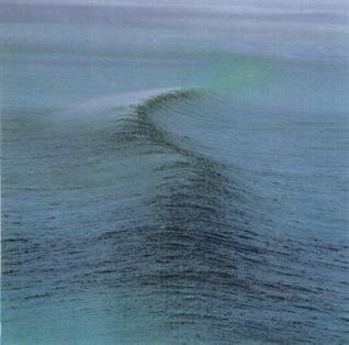
Ride, Nowhere (1990)
Donal was first inspired to become a graphic designer through vinyl design and music artwork for albums back in the 1990s. “When I was 14 or 15 I got an album [“Nowhere”] from a band called Ride, and the cover was a picture of a wave out of the ocean, the name was embossed out of the cover, the inside sleeve was black paper, it was just really, really well-designed. And it had never occurred to me before that bands didn't do that themselves, it didn't occur to me that people just did that... [that] this is actually a thing I could do for a living.”
That moment sparked a world of possibilities for him, a revelation that has led to this very day, and the album artwork and music show posters that define entire bands or venues both here in Dublin and internationally. This is something that many in the generations who can remember music pre-digital can relate to: the tactile products and objects linked to the music that most influenced us. For myself, in the 1990s, the journey through a CD jacket laid out with lyrics, photography, or artwork was a visual blueprint for perceiving the music. Before the frenetic world of the contemporary computer or mobile phone screen, print media had an enormous impact on the music listener.
Prominent album sleeve designer Vaughan Oliver, who notably designed the cover for The Pixies’ Doolittle in 1989, has also stated that he first became interested in graphic design through album artwork of the 1970s: “ I was a working class lad from a dull town in County Durham, there was no real culture, my parents were not really interested in anything unusual – everything I was getting was through record sleeves. It was a democratic way of discovering art. The local record shop was an art gallery for me.” Prior to the Internet, the space of music shops and the physicality of albums had a massive impact on consumers; the visual component of the music provided a conceptual blueprint to support the listening experience.
Case Study: ‘A Love Supreme’ and ‘Lift Your Skinny Fists Like Antennas to Heaven’
Donal’s piece, ‘A Love Supreme’, is a re-envisioning of John Coltrane’s A Love Supreme (Impulse! Records, 1965) for “Fantasy 12: A Fantastical Trip into Iconic Album Artwork". A collaborative project between Dublin-based collectives Hen’s Teeth, This Greedy Pig, and ChoiceCuts, Fantasy 12 is an exhibition that commissioned designers to visually interpret influential albums. Donal’s contemporary version of Coltrane’s album departs entirely from the original artwork, using digitized contour drawing overlaid on bold color planes with an experimental usage of type. The original relies on monochrome photography of John Coltrane, while Donal’s is an illustrative focus on the hands - possibly in reference both to the primary tools of the jazz musician and the spirituality of Coltrane’s music (see Figs. 11-12).
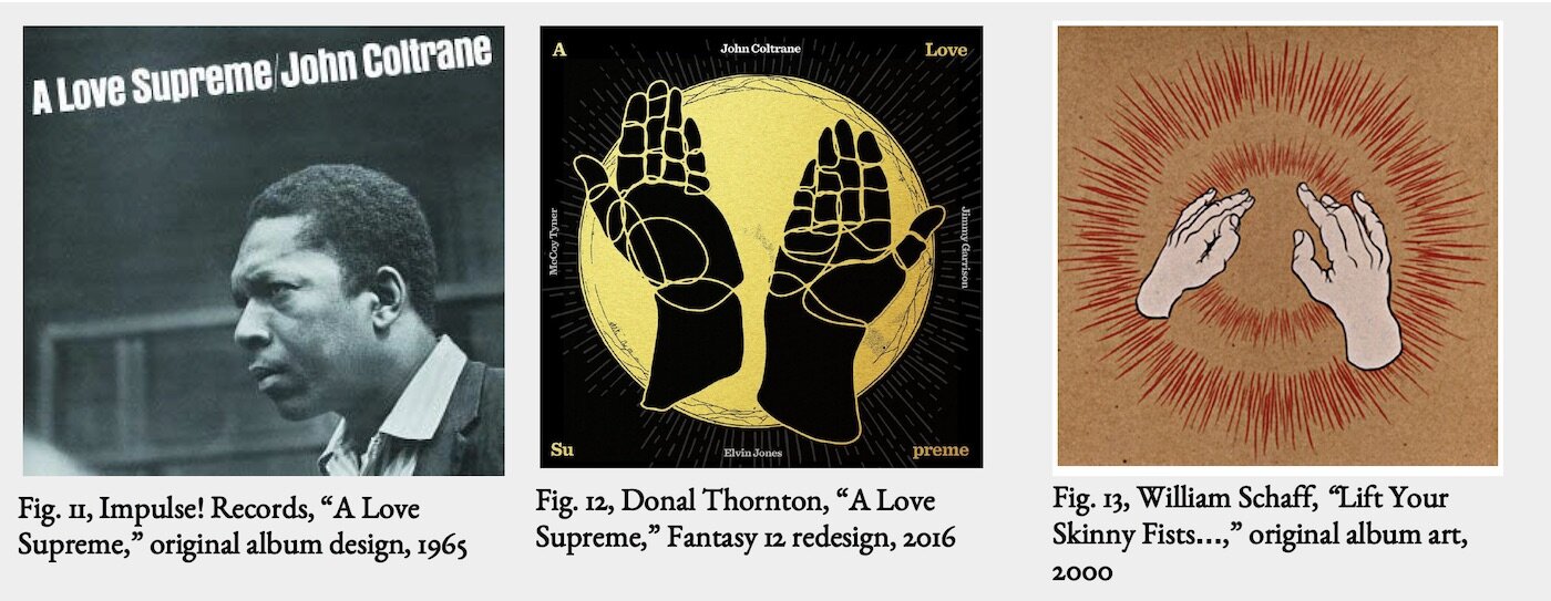
I recognized a direct visual connection with the album artwork of a completely different era and genre: the Canadian post-rock band Godspeed You! Black Emporer’s (GY!BE) Lift Your Skinny Fists Like Antennas to Heaven (Constellation/Kranky Records, 2000), with artwork by U.S. artist William J. Schaff. This album art focuses on uplifted hands with a haloed line-stroke effect supporting the main imagery – similar core elements to Donal’s A Love Supreme interpretation (see Fig. 13).
Examining both of these, the coincidental GY!BE reference purely through my own music exposure, they seem to reference a ‘holy’ or spiritually ecstatic theme through the main elements of the uplifted hands and the haloed details. GY!BE’s musical content is notoriously political, critical and foreboding of modernity and industrialization, and resistant to religious influence on society. Yet, Coltrane’s album has strong thematic links to spirituality and religious devotion as demonstrated by tracks such as “Psalm” and his own poem in the liner notes titled “A Love Supreme.”
As Richard Brody writes of the album, “[It’s] an idea, an abstraction, a sublime idealization of Coltrane’s religious philosophy. It has an air of autobiographical reflection and personal confession—one that’s emphasized by his liner notes, in which he cites 1957 as the year of his ‘spiritual awakening’...”. (The New Yorker, 2015) I took from this comparison of two very different albums with similar artwork that designers may rely on recognizable symbols or imagery that will have a strong association or impact with the viewers - ie., the praising hands of worship - to bring new meaning to the object itself, and to make a statement about the content.
Social Design: Visual Communication for a Cause
Donal worked briefly with a friend in Berlin a few years ago to develop an effective logo image to raise awareness about a Refugees Welcome campaign, particularly about inhumane refugee detention facilities with the intention of getting businesses behind the effort to assist them. “I got an email that said he was protesting outside a place that was holding refugees in Berlin and it was a horrific place with chain-linked fences,” said Donal. He worked from a recognizable public image used widely around the US-Mexico border that warns motorists about people crossing major roads. Going from this image, he integrated the chain-linked fence described by his friend to customize the image to the refugee crisis in Berlin (see Figs. 26 and 27). Within the context of the current movement [as of 2015] of refugees and migrants into Europe motivated by conflict and economic need, a crisis of numbers unprecedented since World War II, the appropriation of this image from other militarized border areas is an effective tool for communicating a message of compassion for refugees.

“I got an email that said he was protesting outside a place that was holding refugees in Berlin and it was a horrific place with chain-linked fences.”
From a radio interview on her 2011 book Line in the Sand: A History of the Western U.S.-Mexico Border, American historian Rachel St. John highlights the distinctly modern notion of national borders as a primary means to control the movement of people: “There's a lot of rhetoric of 'We have lost control of the border.' Studying the history of the border, I don't see a time when the United States ever had control. It's always a negotiation between governments trying to establish certain laws, people who want to evade those laws finding ways to do so, government coming back, smugglers responding in turn.” And similar to the currently highly controversial politics surrounding that North American border, the politics of Europe’s borders have also become far more scrutinized and debated since the historical movement of refugees attempting to reach the EU in the past few years.
Andrew Shea discusses the need for designers to confront controversy, and why it is the skilled designer’s job to clearly facilitate this process. “Some projects deal with controversial subject matter. It is your job to address these issues… Effectively confronting controversy is a tall order for a poster or website design… Meet with community partners frequently to make sure that your designs emphasize the outcomes that are needed” (Designing for Social Change, 2012).
In this case, the Refugees Welcome image was developed quickly for a fast turnover, and the outcome is effective as far as communicating a message goes. As Donal said, the image from the US-Mexico border signs is essentially “shorthand for escaping family;” his final image connects the modern global phenomenon of tightly controlled borders and strict enforcement of “legal” and “illegal” movement, and locates itself on a specific side of a current controversy over human rights and asylum in Europe.
Pro Bono and Gratis: Alternative Valuation of Design
The issue of working for free (“gratis”) should be distinguished from “pro bono,” meaning “for good.” As many aspiring designers and students can relate to, it is often tempting and encouraged to do short-term free labor for the long-term benefit: unpaid internships, work for friends, etc. And these do often pay off with exposure and portfolio pieces; however, when progressing in one’s career, the development and cementing of professional boundaries and ethics helps the designer maintain value in their work and establishes a dignified and non-exploitive relationship with clients.
One tip that is recommended by Jason Tselentis in [now defunct HOWDesign’s] article “Graphic Design for Good: The Do’s and Don’ts of Pro Bono Design”, is to “... stay true to your values. Whether for free or for a fee, create a contract, timeline, scope of work and revision requests. And before you take the pro bono plunge, recognize how it benefits you as a designer, along with the client and the general public.” In our interview, Donal also made an important point: “...if you don't know them it’s good to give a nominal fee so... they can put a value on your time… sometimes if you're doing something for free, you're quick to snap at them if they're looking for something to be done on time.”
“...stay true to your values. Whether for free or for a fee, create a contract, timeline, scope of work and revision requests. ”
In terms of the ways that pro bono work can provide “alternative compensation,” Andrew Shea comments, “Adding clauses such as [alternative forms of compensation, ie. recognition, copyright, donor status, etc.] will help you remain motivated through the difficult parts of the design process and will help your client realize the value of your efforts.” Generally, money determines labor’s fundamental standard of “value,” regardless of peripheral benefits. It may very well have an impact to charge even a small fee to meet that standard transaction of “value” between client and designer, and to maintain professionalism.
What are the motivations for designers to produce pro bono or free work? Why would someone who needs to make a living in their field voluntarily work for free in that field? My theory is, in part, for the same reasons anyone volunteers any labor for free when they still need to eat and pay rent: a motivation of compassion or a sense of social responsibility.
I asked Donal about pro bono work, which included the Refugees Welcome logo and the Dublin Feminist Film Festival (see Figs. 31-33). He noted a personal motivation for doing the worthwhile pro bono work of the Feminist Film Festival: he has two young daughters. He views his donated labor to the project as important on the broader level of supporting politics that uplift and empower his own children.

In the context of capitalism, low-funded organizations, individuals, and projects seeking to create positive change simply may not have the resources to meet the enormous needs in the world without labor transactions of an alternative kind. It is an imperfect reality maintained by deep inequality; thus, in a world that places huge value on the visual, pro bono design is both a needed and important contribution to such projects.
Select Works Cited
Brody, Richard, “Seeing Through A Love Supreme to Find John Coltrane,” The New Yorker, 17 November 2015 [online]
Butler, Andy, “Interview with Graphic Designer Vaughan Oliver,” Designboom Magazine, [online], 19 December 2014
Donal Thornton, “Projects” [on-line], 2016
Hollis, Richard, Graphic Design: A Concise History , 2nd edn. Thames & Hudson Ltd: London, 2014.
Parkinson, Charles, “The Year Europe Buckled Under The Worst Refugee Crisis Since World War II,” VICE, [online], 31 December 2015
Shea, Andrew, Designing for Social Change. Princeton Architectural Press: New York, 2012.
Thornton, Donal, interviewed by Clara Dudley, 26 January 2017, Temple Bar, Dublin
Tselentis, Jason, “Graphic Design for Good: the Dos and Don’ts of Pro Bono Design”, HOWDesign, Fall 2016 issue [online]
Vega, Monica, “The Issue of Building the Wall,” Infusion Magazine, 4 May 2016
WEKU Radio, “The ‘Line in the Sand’ Dividing the U.S. and Mexico [interview with Rachel St. John],” Morning Edition on WEKU, NPR, [online], 2011